

Story Board: Slide Tab
The Slide tab provides end users with the functions to layout, style and format slides and panels.
Tab Buttons
Slide
- Slide Heading - provides a dialog for editing the slide's name in the slide tree. This heading is used to generate the tab titles in the runtime.
- Right-to-Left Layout - toggles story board components between right-to-left (and left-to-right) format. This option may be disabled by administrators and may not be visible.
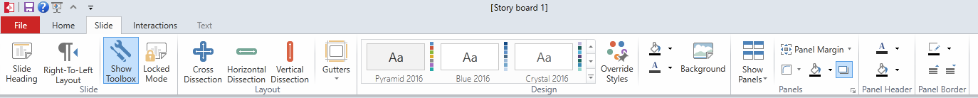
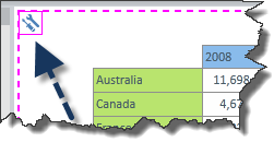
- Show Toolbox provides a toggle button to show/hide the toolbox grids and function squares during design time. By default these are on, but are usually turned off to simplify the design interface or to get a better sense of layout. Right clicking on the toolbox icon (blue arrow in image below) will expose a number of functions that will enable designers to tweak and adjust the way content will look and work when the dashboard is launched into runtime.
- Locked Mode provides a toggle button to show or hide the canvas dissections during design time. By default these are on, but are usually turned off to simplify the design interface or to get a better sense of layout.
Layout
- Cross / Horizontal / Vertical Dissection buttons are tools for dividing up the slide canvas into separate panes. Each pane can contain query elements. A pane can also be sub-divided by a subsequent dissection.
- Gutters - Header, Footer, Left Gutter, Right Gutter buttons provide a convenient way to add a gutter border to the four edges of the slide canvas. Query content cannot be added into gutter zones. However Asset content can be added.
Design
- Slide Themes - this panel provides users with a fast and easy mechanism to reformat their slides using predefined themes. The extended tool menu provides system themes plus any additional ones that have been added by the your administrators. Themes apply across the ENTIRE slide and all its subordinate components (grids, charts etc).
- Override Styles - provides a toggle switch to force the slide theme buttons to OVERRIDE any theme and formatting settings of the content currently on the slide canvas with the settings of the selected theme subsequently clicked.
- The color palettes offer a quick way to format the slides background color and key font colors.
- Background - provides a full dialog for changing the slide's background. The background can be set to flat colors, gradients and images. Click here for more.
Panels
- Show Panels provides a toggle button to hide/show the panel boxes that are applied to each pane on the canvas. Panel boxes are often used to keep the runtime interface clearer by demarcating the different query elements on the slide. See panels for more info.
- Panel Formatting a selection of buttons and menus that provide access to a variety of settings for formatting the way a panel box is displayed in the slide. See panels for more info.
Panel Header
- The color palettes offer a quick way to format the panel header's background color and key font colors. See panels for more.
Panel Border
- The color palette and border size buttons offer a quick way to format the panel border's color and thickness. See panels for more.
Home |
Table of Contents |
Index |
User Community
Pyramid Analytics © 2011-2022